TypographyDraft
Provet Cloud Design System provides a constrained, purposeful set of typographic styles that we use to present user interface and content as clearly and efficiently as possible.

Typographic scale
We use the following typographic scale to communicate visual hierarchy in text and to create a predictable sizing for headers and text content. Our typographic scale is purposefully harmonious with our spacing scale. The base font-size is 14px.
| Category | Size | Difference | Size token |
|---|---|---|---|
Typescale XXXL | 36px (2.25rem) | +12px | var(--n-font-size-xxxl) |
Typescale XXL | 24px (1.5rem) | +4px | var(--n-font-size-xxl) |
Typescale XL | 20px (1.25rem) | +4px | var(--n-font-size-xl) |
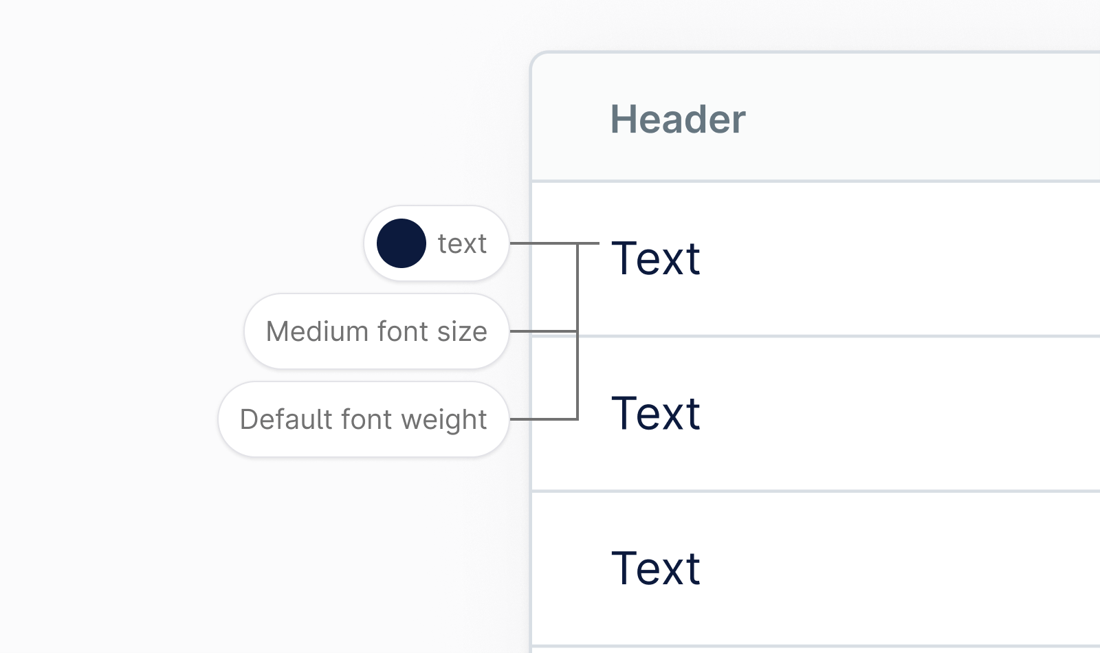
Typescale L | 16px (1rem) | +2px | var(--n-font-size-l) |
Typescale M | 14px (0.875rem) | 0 | var(--n-font-size-m) |
Typescale S | 12px (0.75rem) | -2px | var(--n-font-size-s) |
Typescale XS | 11px (0.6875rem) | -1px | var(--n-font-size-xs) |
Line length
Set the reading environment to suit the reader. Shorter lines are usually more comfortable to the reader. As the line length increases, the user’s eye has to travel further from the end of one line to the beginning of the next, making it harder to track their progress vertically. Aim for an average line length of 50–90 characters, including spaces.
Please keep in mind that our users can control the application layout width, meaning that a line length can not always be specified. For this reason, it’s good practice to design for an ideal line length range, and use responsive design techniques to anticipate different contexts.

Tables
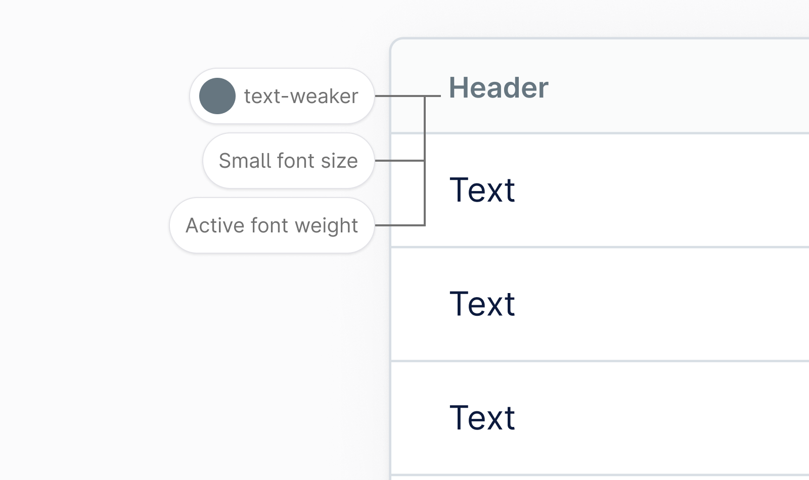
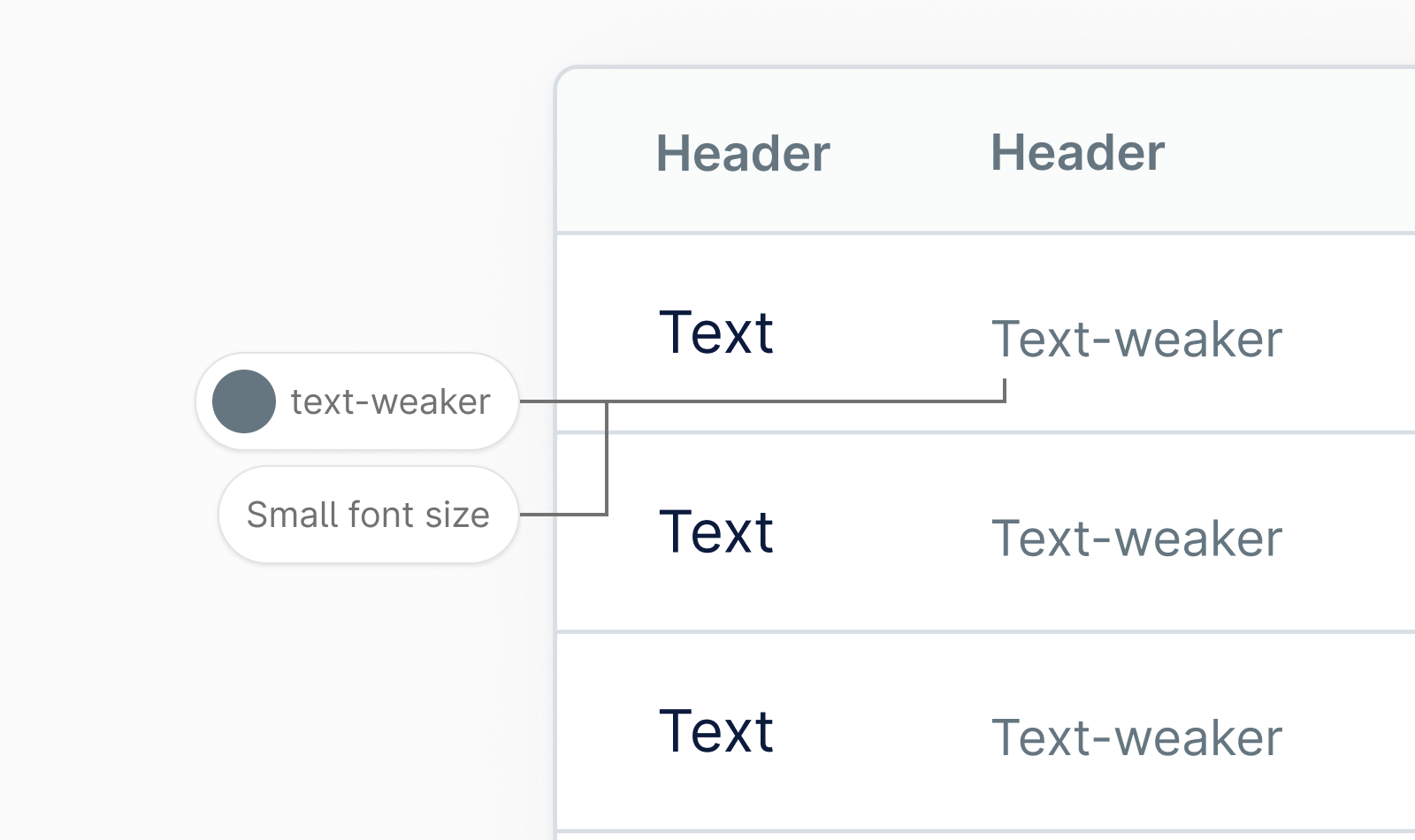
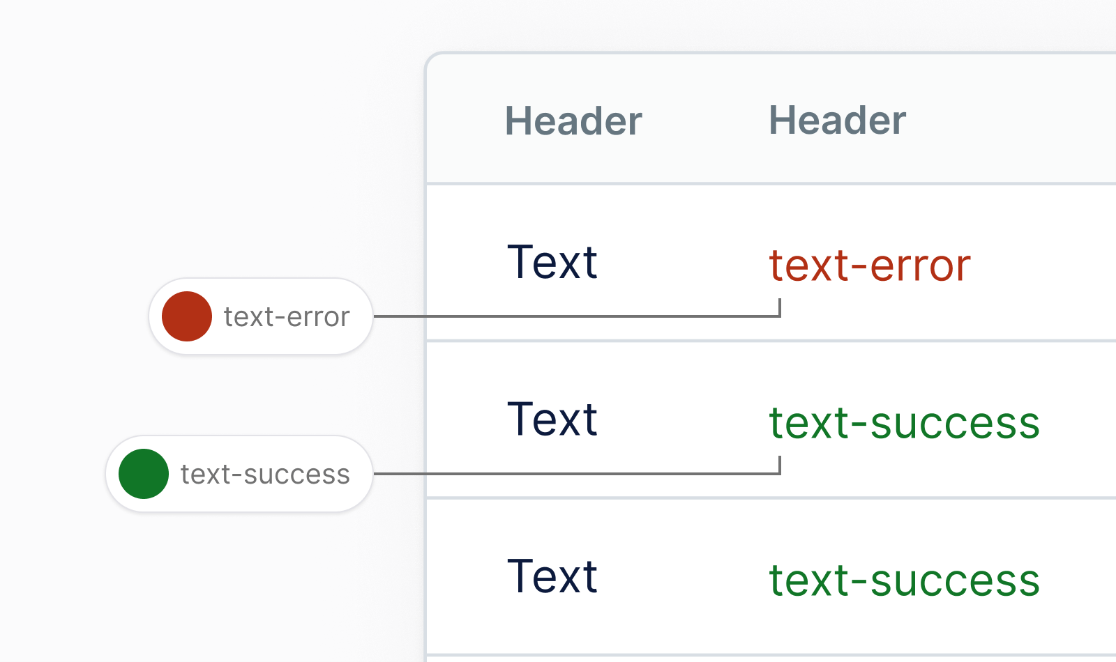
For tables Provet Cloud Design System offers default text styles that provide a legible and accessible typography. Typographic treatment should be consistent across all tables to create a cohesive language. The font size is large enough for users to read comfortably, and the font weight and color should be appropriate for the type of data in each table cell.
Brand typography
We use a typeface called Armin Grotesk for almost everything related to Provet Cloud brand and marketing — from banner ads to print materials. This typeface should not be used for application UIs where we use a typeface called Inter.

Product typography
For digital products, we use a typeface called Inter which is carefully crafted and designed for computer screens specifically. It features a tall x-height to aid in readability of mixed-case and lower-case text. Several OpenType features are provided as well, like contextual alternates and slashed zero for when you need to disambiguate "0" from "O".

Font stacks
We use sans serif fonts for most of our type in digital products, the only exception being when you want to display code.
Sans serif font stack:
font-family: 'Nordhealth Sans', -apple-system, BlinkMacSystemFont, 'Segoe UI', Helvetica, Arial, sans-serif, 'Apple Color Emoji', 'Segoe UI Emoji';Code font stack:
font-family: 'Nordhealth Mono', monospace, monospace;Punctuation
Punctuation matters because it conveys pause and effect to the reader, and mastering it walks the fine line between a skill for typographers and a skill for copywriters. The most common mistake we often see is using a neutral or straight quote symbol in place of an apostrophe:
Always use smart quotation marks and put commas and periods inside the quotation:
Use multiplication sign, minus sign and plus sign correctly:
Use correct units of measurement symbols:
Use real trademark and copyright symbols:
When writing pixel dimensions, use times sign:
Use the prime and double prime instead of quotation marks to specify inches and feet:
Use em dash (—) and thin spaces ( ) to make a break between parts of a sentence:
use en dash (–) and thin spaces ( ) when indicating a range of values:
Use ellipsis instead of three periods to indicate an omission:
Getting support
Need help with typography? Please head over to the Support page for more guidelines and ways to contact us.